***This document provides helpful tips to improve your site's accessibility. While it doesn’t guarantee 100% compliance, it’s a great starting point to make your website more inclusive and user-friendly.***
Identification:
Rule ID: color-contrast
Part of: axe-core 4.10
Severity: Serious
Applicable Standards:
WCAG 2.0, 2.1, 2.2 (Level AA)
Trusted Tester
EN 301 549
Impact:
Affects users with low vision and colorblindness
Approximately 8% of men and 0.4% of women in the US have some form of color vision deficiency
Proper Implementation:
Ensure contrast ratio of at least 4.5:1 for small text
Ensure contrast ratio of at least 3:1 for large text (18pt/24px or 14pt/19px bold)
Consider both foreground and background colors, including transparency and opacity
Use color contrast analyzer tools to verify compliance
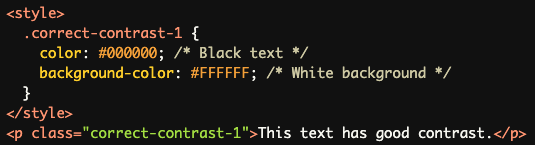
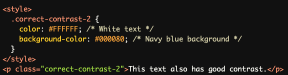
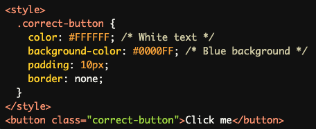
Examples of Correct Usage:
Dark text on a light background (e.g., black text on white background)
Light text on a dark background (e.g., white text on navy blue background)
Sufficiently contrasting colors for text and background in buttons and other UI elements
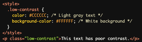
Common Errors to Avoid:
Using low-contrast color combinations (e.g., light gray text on a white background)
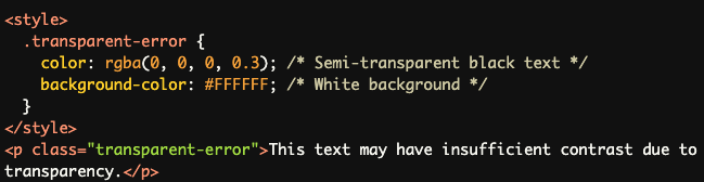
Ignoring transparency/opacity in foreground colors
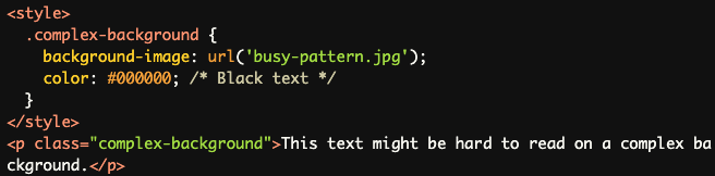
Overlooking text in images or complex backgrounds
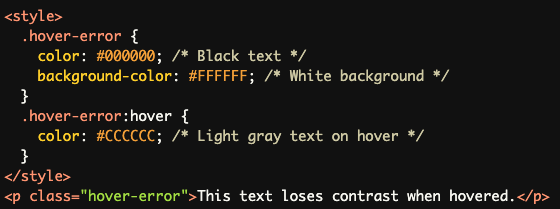
Neglecting contrast in hover or focus states
Rationale:
Improves readability for users with low vision
Enhances usability for individuals with color blindness
Helps all users distinguish text from backgrounds, especially in varying lighting conditions
Evaluation Method:
Automated checks for contrast ratios of all text elements
Considers disabled buttons and ignores elements with background images
Manual review required for elements with 1:1 ratio or complex backgrounds
Use of color contrast analysis tools for verification
Note: This rule does not report on text elements with background images, those obscured by other elements, or images of text. These may require additional manual evaluation.