***This document provides helpful tips to improve your site's accessibility. While it doesn’t guarantee 100% compliance, it’s a great starting point to make your website more inclusive and user-friendly.***
Identification
Input buttons must have discernible text (Rule ID: input-button-name)
Applicable Standards
WCAG 2.0, 2.1, 2.2 Level A (4.1.2)
Section 508 (1194.22)
Trusted Tester Guidelines
EN 301 549 (9.4.1.2)
Impact
Critical level impact affecting:
Blind users
Deafblind users
Proper Implementation
Input buttons must have accessible names using one of these methods:
value attribute
aria-label
aria-labelledby
title attribute
Default values for submit/reset buttons
Examples of Correct Usage
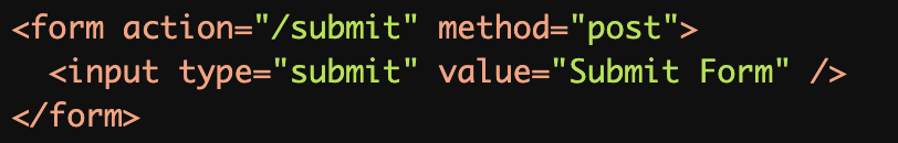
Using the
valueAttribute:
Thevalueattribute provides clear and descriptive text ("Submit Form") for the button, ensuring screen readers announce its purpose.
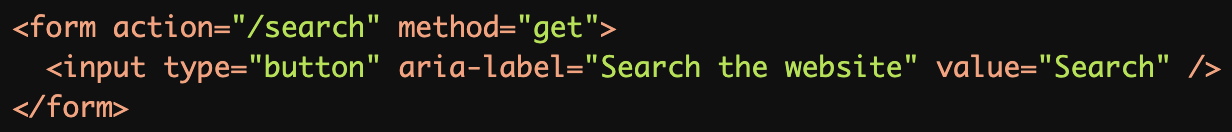
Using the
aria-labelAttribute:
Thearia-labelattribute provides additional clarity for screen reader users while the visible text ("Search") remains concise.
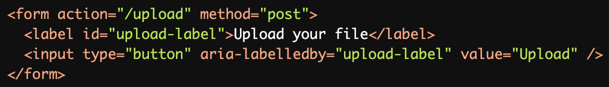
Using the
aria-labelledbyAttribute:
Thearia-labelledbyattribute references an external label, ensuring the button's purpose is programmatically linked and accessible.
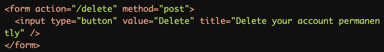
Using the
titleAttribute for Additional Description:
Thetitleattribute provides additional context for the button's action ("Delete your account permanently") while thevalueremains concise.
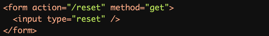
Default Values for Submit/Reset Buttons:
The default text for the reset button ("Reset") is clear and descriptive, making it accessible without further customization.
Common Errors to Avoid
Missing
valueAttribute:
Without avalueattribute, the button's purpose may be unclear, especially if the default text is not meaningful in the context of the form.
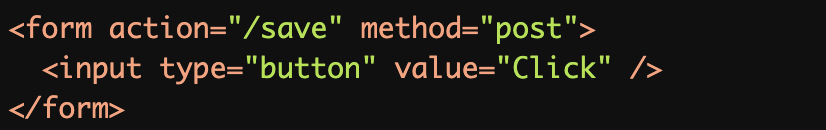
Non-Descriptive Button Text:
The button text ("Click") is vague and does not describe the action it performs, leaving users uncertain about its purpose.
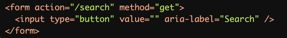
Relying Solely on Visual Context:
While thearia-labelmakes the button accessible to screen readers, the lack of visible text can confuse sighted users.
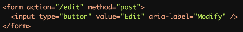
Conflicting Accessible Names:
Conflicting accessible names ("Edit" and "Modify") can confuse screen reader users, leading to unclear instructions.
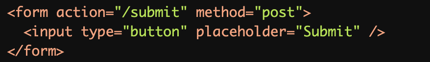
Using Placeholder Text Instead of a Button Label:
Theplaceholderattribute is not announced by screen readers for buttons and does not replace the need for a clear label orvalue.
Rationale
Screen reader users need text to understand button purpose
Unlabeled buttons create barriers to:
Understanding button function
Navigation
Form completion
Interactive elements usage
Clear button labels ensure proper user interaction
Evaluation Method
Inspect the Code
Ensure all
<input>buttons include:A meaningful
valueattribute.Or an accessible name via
aria-labeloraria-labelledby.Or a meaningful
titleattribute, if supplementary context is required.
Test with Assistive Technology
Use a screen reader (e.g., NVDA, JAWS, or VoiceOver) to navigate the page and confirm buttons are announced with their purpose clearly described.
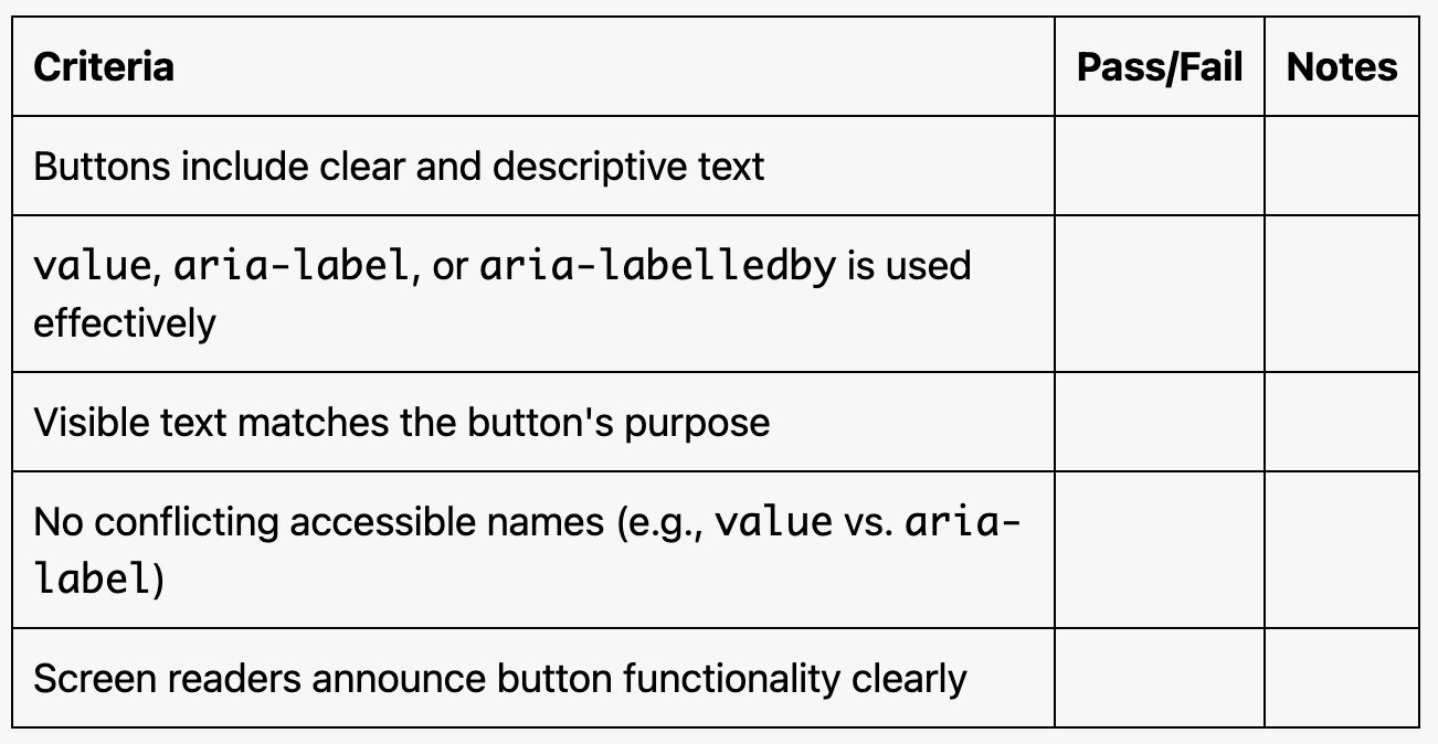
Evaluation Checklist