***This document provides helpful tips to improve your site's accessibility. While it doesn’t guarantee 100% compliance, it’s a great starting point to make your website more inclusive and user-friendly.***
Identification
Links must be distinguishable without relying solely on color (Rule ID: link-in-text-block)
Applicable Standards
WCAG 2.0, 2.1, 2.2 Level A (1.4.1)
Trusted Tester Guidelines
EN 301 549
Impact
Serious level impact affecting:
Users with low vision
Users with color blindness (8% of men, 0.4% of women)
Proper Implementation
Links must have:
Color contrast ratio of at least 3:1 with surrounding text
Visual indicators beyond color (underline, border, etc.)
Distinct hover and focus states
Clear visual differentiation from non-link text
Examples of Correct Usage
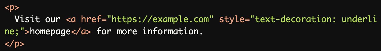
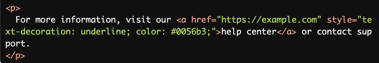
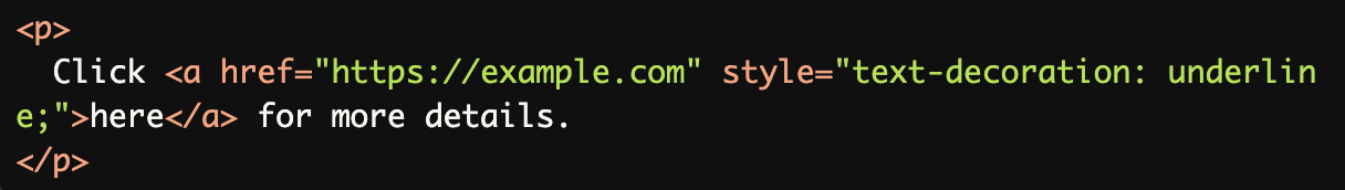
Underlined Links:
Links are underlined, making them visually distinguishable from surrounding text without relying solely on color.
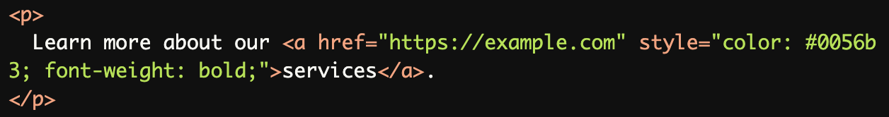
High Contrast Between Link and Text:
The link has a high contrast color (dark blue) and a bold font weight, making it stand out clearly from the surrounding text.
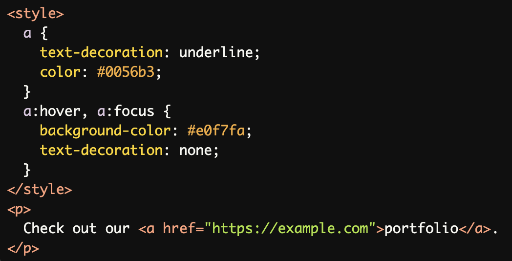
Hover and Focus States:
Links include a hover and focus state with a background color change, providing additional visual feedback for interactivity.
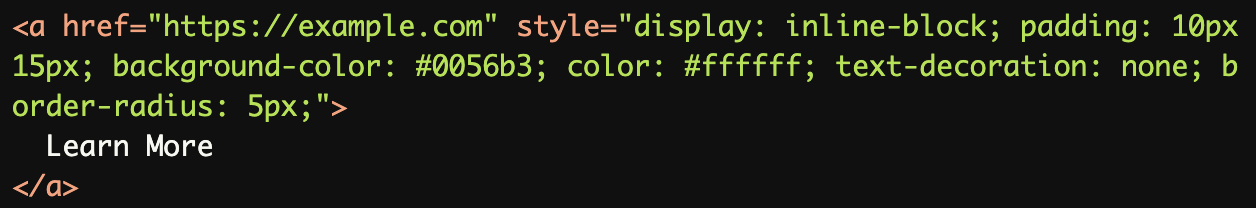
Links in Buttons:
The link is styled as a button with a clear background color, ensuring it is visually distinct and easy to identify as interactive.
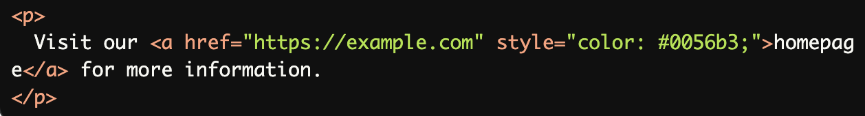
Links Differentiated by Both Style and Context:
The link is underlined and uses a distinct color, ensuring it is distinguishable within the context of the text.
Common Errors to Avoid
Relying Solely on Color:
The link uses only a color difference (blue) to distinguish itself. This is inaccessible for users with color vision deficiencies who may not see the color difference.
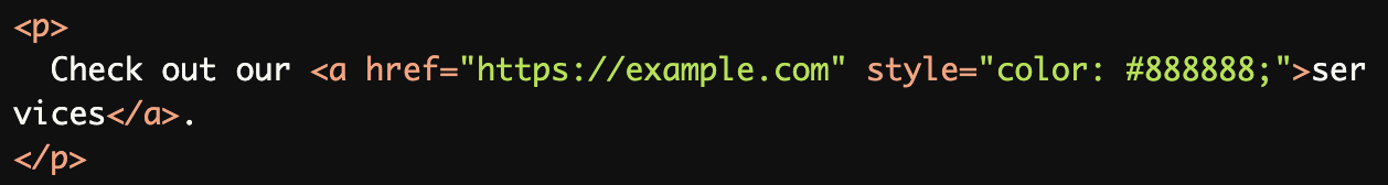
Lack of High Contrast:
The link color (light gray) does not have sufficient contrast against the surrounding text, making it difficult to distinguish, especially for users with low vision.
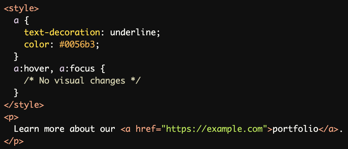
No Visual Feedback on Hover or Focus:
The link does not provide any visual feedback (e.g., color change, underline removal) on hover or focus, making it harder to recognize as interactive.
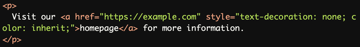
Links Styled Like Regular Text:
The link is styled like regular text, with no underline or color difference, making it indistinguishable from surrounding content.
Ambiguous Links Without Context:
Using generic text like "here" without contextual clues makes the link less usable and harder to identify as meaningful content.
Rationale
Color-only differentiation excludes:
Users with color blindness
Users with low vision
Users with contrast sensitivity issues
Multiple visual indicators ensure:
Universal link recognition
Better user experience
Improved navigation
Evaluation Method
Inspect the Code
Verify that links are visually distinguishable by:
Using underlines, bold text, or background highlights.
Ensuring a color contrast ratio of at least 3:1 with surrounding text.
Check for hover and focus states to confirm additional feedback is provided.
Test with Assistive Technology
Use a screen reader to confirm that links are announced correctly.
Navigate the page using the keyboard (Tab key) to ensure links are visually distinct during focus.
Simulate Color Vision Deficiencies
Use tools like:
Color Contrast Analyzer to check contrast ratios.
NoCoffee Vision Simulator to test how the page appears to users with color blindness or low vision.
Evaluation Checklist