***This document provides helpful tips to improve your site's accessibility. While it doesn’t guarantee 100% compliance, it’s a great starting point to make your website more inclusive and user-friendly.***
Identification
ARIA toggle fields must have an accessible name (Rule ID: aria-toggle-field-name)
Applicable Standards
WCAG 2.0, 2.1, 2.2 Level A (4.1.2)
EN 301 549 (9.4.1.2)
Trusted Tester Guidelines
Impact
Serious level impact affecting:
Blind users
Deafblind users
Users with mobility impairments
Proper Implementation
Toggle fields must have an accessible name using one of:
aria-label
aria-labelledby
Native text content
title attribute
Associated label element
Examples of Correct Usage
Using
aria-labelfor Accessible Names:
Thearia-labelprovides a descriptive name ("Enable notifications") that screen readers announce, ensuring users know the purpose and state of the toggle.

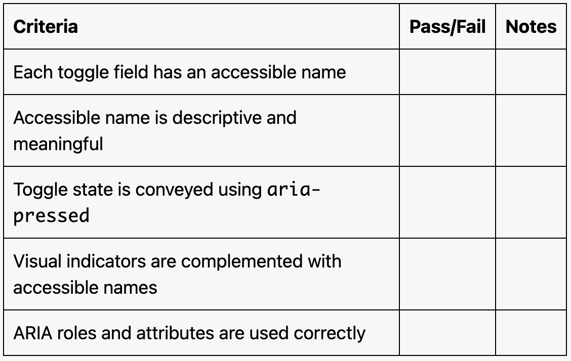
Using aria-labelledby to Reference a Label:
Thearia-labelledbyattribute references the text in the label (#toggle-label), making the toggle field accessible with a descriptive name.
Using Native Text Content:
The button's text ("Toggle Dark Mode") acts as its accessible name, which is announced along with the state (pressed or not) by screen readers.

Using a
titleAttribute:
Thetitleattribute provides additional context for the toggle's purpose. While screen readers may announce it, usingaria-labeloraria-labelledbyis preferred.

Using an Associated
labelElement:
Thelabelelement is associated with the toggle field via theforattribute, ensuring the toggle is clearly labeled.

Common Errors to Avoid
Missing Accessible Name:
The toggle field lacks an accessible name, making it impossible for screen readers to announce its purpose.

Using Non-Descriptive Labels:
Thearia-label("Toggle") and button text ("Click") are too vague, failing to convey the toggle's actual purpose.

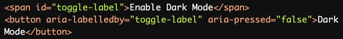
Inconsistent State Announcements:
The samearia-label("Toggle notifications off") is used for both states, which confuses screen reader users about the toggle's state.
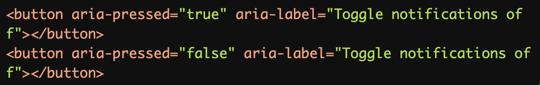
Over reliance on Visual Indicators:
The images lack meaningfulalttext, and there is no accessible name provided for the toggle fields.
Using Incorrect ARIA Roles:
Therole="checkbox"is used instead ofaria-pressedfor a toggle button, causing confusion for assistive technologies, as "checkbox" implies a different interaction pattern.

Rationale
Essential for screen reader users to understand the purpose of toggle fields
Enables proper identification of interactive elements
Required for meeting WCAG success criteria
Critical for form interaction and navigation
Evaluation Method
Inspect the Code
Verify that:
Each toggle field has an accessible name using
aria-label,aria-labelledby, native text, or alabel.The toggle's state is conveyed using
aria-pressed.The accessible name is descriptive and meaningful.
Test with Assistive Technology
Use a screen reader (e.g., NVDA, JAWS, or VoiceOver) to confirm:
The toggle's name and state are announced clearly and accurately.
The toggle behaves as expected when activated (e.g., state changes).
Evaluation Checklist