***This document provides helpful tips to improve your site's accessibility. While it doesn’t guarantee 100% compliance, it’s a great starting point to make your website more inclusive and user-friendly.***
Identification
ARIA tooltip elements must have an accessible name (Rule ID: aria-tooltip-name)
Applicable Standards
WCAG 2.0, 2.1, 2.2 Level A (4.1.2)
EN 301 549 (9.4.1.2)
Impact
Serious level impact affecting:
Blind users
Low vision users
Users with mobility impairments
Proper Implementation
Tooltips must have an accessible name using one of:
Inner text content
aria-label attribute
aria-labelledby reference
title attribute
Text must be discernible to screen readers
Examples of Correct Usage
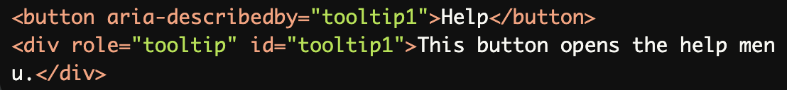
Using Inner Text for Accessible Names:
The tooltip content is provided as inner text, ensuring it is accessible to screen readers via thearia-describedbyattribute.
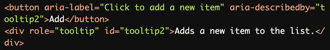
Using
aria-labelfor a Custom Name:
Thearia-labelprovides a clear name for the button, while the tooltip adds context for screen readers.
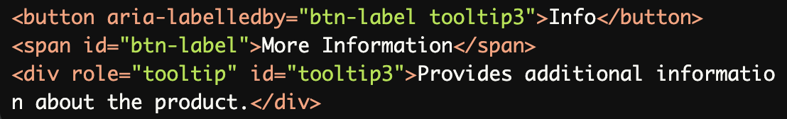
Using
aria-labelledbyto Reference a Label:
Thearia-labelledbyattribute references both the button label and the tooltip, ensuring screen readers announce them together.
Using the title Attribute for Tooltips:
Thetitleattribute is used as a simple tooltip for accessible names, which is announced by screen readers.

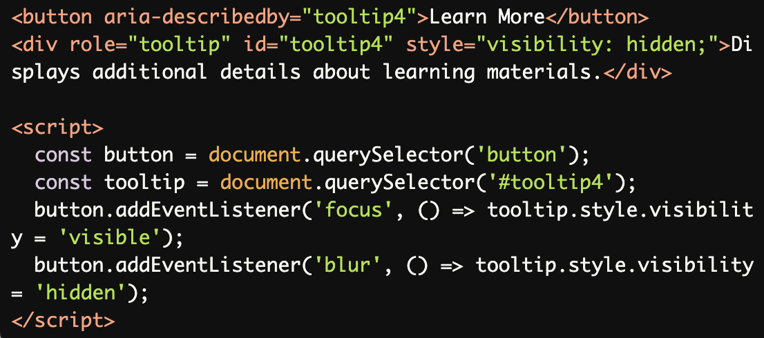
Combining Tooltip Visibility with Accessibility:
A hidden tooltip becomes visible when the button is focused, but the accessible name remains available to screen readers.
Common Errors to Avoid
Missing Accessible Name:
The tooltip element lacks inner text or an accessible name, making it empty and useless for screen readers.

Using Non-Descriptive Text:
The tooltip text ("Click here") is too vague and does not provide meaningful information about the button's purpose.

Tooltip Without a Trigger Element:
The tooltip exists without being associated with a trigger element (e.g., a button) viaaria-describedby, making it inaccessible.

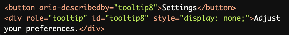
Using
role="tooltip"Without Visible Content:
The tooltip is hidden withdisplay: none, making it unavailable to screen readers. Usevisibility: hiddeninstead to hide visually but keep it accessible.
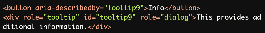
Overuse of ARIA Roles:
Using multiple ARIA roles (e.g.,role="tooltip"androle="dialog") on the same element creates confusion for assistive technologies.
Rationale
Essential for screen reader users to understand tooltip content
Ensures tooltips convey their intended information
Required for effective user interaction
Maintains proper accessibility information flow
Evaluation Method
Inspect the Code
Verify that:
Each
role="tooltip"element is associated with a trigger element (e.g., viaaria-describedby).The tooltip has an accessible name provided by inner text,
aria-label,aria-labelledby, ortitle.Tooltip text is meaningful and descriptive.
Test with Assistive Technology
Use a screen reader (e.g., NVDA, JAWS, or VoiceOver) to confirm:
Tooltips are announced when the associated element gains focus.
The tooltip content is clear and provides useful context.
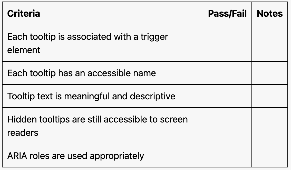
Evaluation Checklist