***This document provides helpful tips to improve your site's accessibility. While it doesn’t guarantee 100% compliance, it’s a great starting point to make your website more inclusive and user-friendly.***
Identification
ARIA dialog and alertdialog elements must have an accessible name (Rule ID: aria-dialog-name)
Applicable Standards
Deque Best Practice
ARIA 1.1 Authoring Practices
Impact
Serious level impact affecting:
Blind users
Low vision users
Users with mobility impairments
Proper Implementation
Provide descriptive accessible names for dialogs
Use either aria-label or aria-labelledby
Ensure referenced labels exist and contain text
Make sure labels are discernible to screen readers
Use meaningful and clear descriptions
Examples of Correct Usage
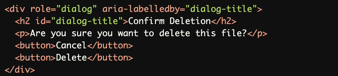
Using
aria-labelledbyto Reference a Visible Heading:
Thearia-labelledbyattribute references a visible heading (h2), ensuring the dialog has a clear and descriptive accessible name.
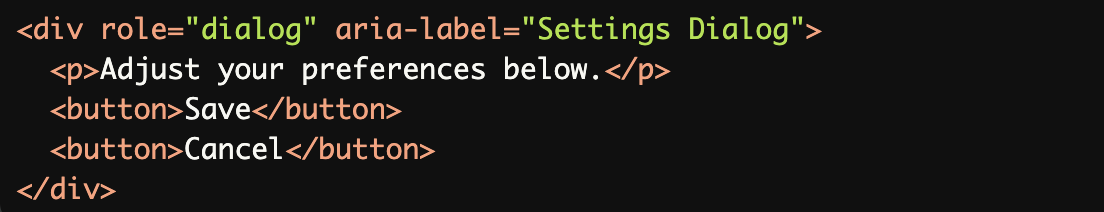
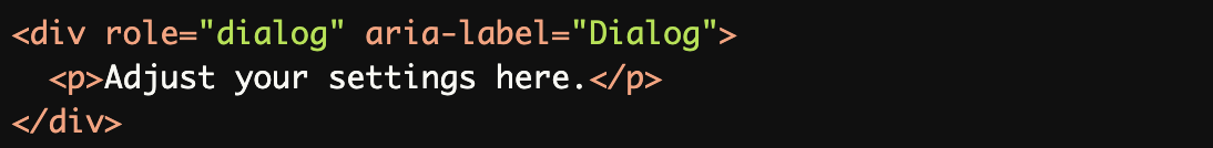
Using
aria-labelfor an Accessible Name:
Thearia-labelattribute provides a concise and meaningful name ("Settings Dialog") for thedialogelement.
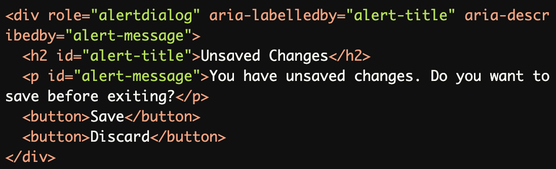
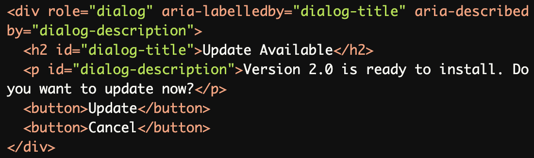
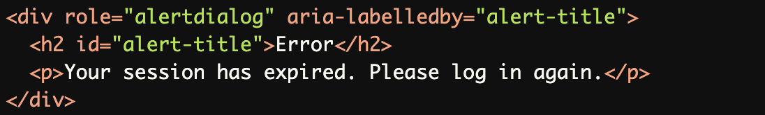
Providing a Name for an
alertdialog:The alertdialog uses both aria-labelledby (for the title) and aria-describedby (for the message) to provide a clear and comprehensive accessible name and description.
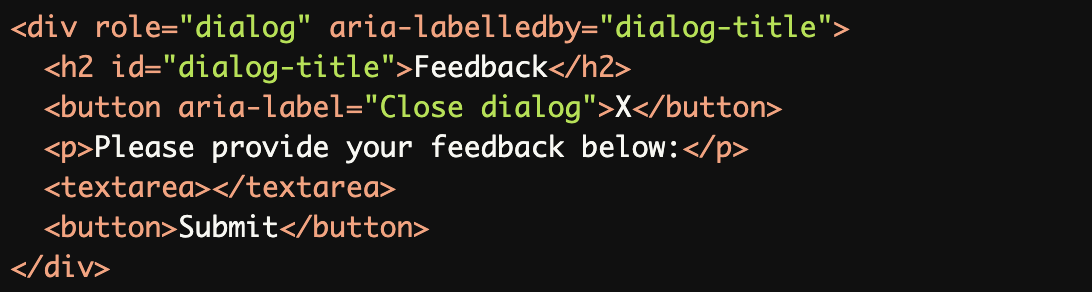
Dialog with a Close Button:
Thearia-labelledbyreferences the visible title, while the close button has anaria-labelto make its purpose clear.
Combining
aria-labelledbyandaria-describedby:The combination of aria-labelledby and aria-describedby ensures the dialog has both a title and a detailed description for screen reader users.
Common Errors to Avoid
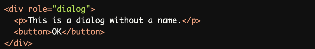
Missing Accessible Name:
The
dialogelement lacks anaria-labeloraria-labelledby, leaving screen reader users unable to identify its purpose.
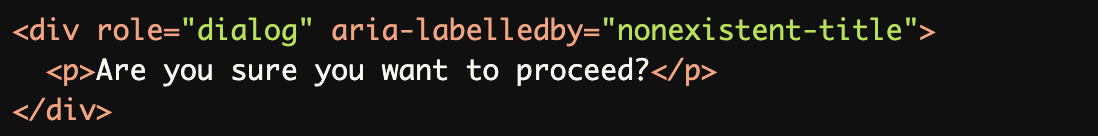
Referencing a Non-Existent Label:
The
aria-labelledbyreferences an invalidid, causing the dialog to have no accessible name.
Generic or Non-Descriptive Name:
Thearia-label("Dialog") is too generic and does not provide meaningful context about the dialog's purpose.
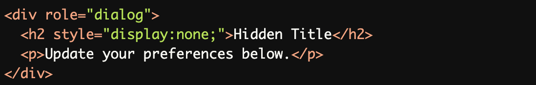
Using Placeholder Text as a Label:
A hidden title is not programmatically associated with the dialog, leaving it without an accessible name.
Missing
aria-describedbyfor Important Context:
Withoutaria-describedbyto reference the message, screen readers may not announce the detailed context of thealertdialog
Rationale
Enables screen reader users to understand dialog purpose
Provides context for modal interactions
Improves navigation and comprehension
Ensures clear communication of dialog content
Maintains proper dialog identification
Evaluation Method
Inspect the Code
Check that:
Each
dialogoralertdialoghas a descriptive accessible name usingaria-labeloraria-labelledby.Titles or labels referenced by
aria-labelledbyexist and are meaningful.Additional context is provided using
aria-describedbywhen necessary.
Test with Assistive Technology
Use a screen reader (e.g., NVDA, JAWS, or VoiceOver) to confirm:
The dialog's purpose is announced clearly.
Both the title (
aria-labelledby) and description (aria-describedby) are read.Interactive elements (e.g., close buttons) are accessible and labeled.
Evaluation Checklist