***This document provides helpful tips to improve your site's accessibility. While it doesn’t guarantee 100% compliance, it’s a great starting point to make your website more inclusive and user-friendly.***
Identification
ARIA input fields must have accessible names (Rule ID: aria-input-field-name)
Applicable Standards
WCAG 2.0, 2.1, 2.2 Level A (4.1.2)
EN 301 549 (9.4.1.2)
Trusted Tester Guidelines
Deque Best Practice
Impact
Serious level impact affecting:
Blind users
Deafblind users
Users with mobility impairments
Proper Implementation
Provide accessible names for all ARIA input fields
Use aria-label or aria-labelledby attributes
Ensure referenced labels exist and contain text
Apply to these roles: combobox, listbox, searchbox, slider, spinbutton, textbox
Labels must be programmatically associated
Examples of Correct Usage
Using
aria-labelfor an Accessible Name:
Thearia-labelprovides a clear and meaningful name ("Search for products"), making it accessible to screen readers.

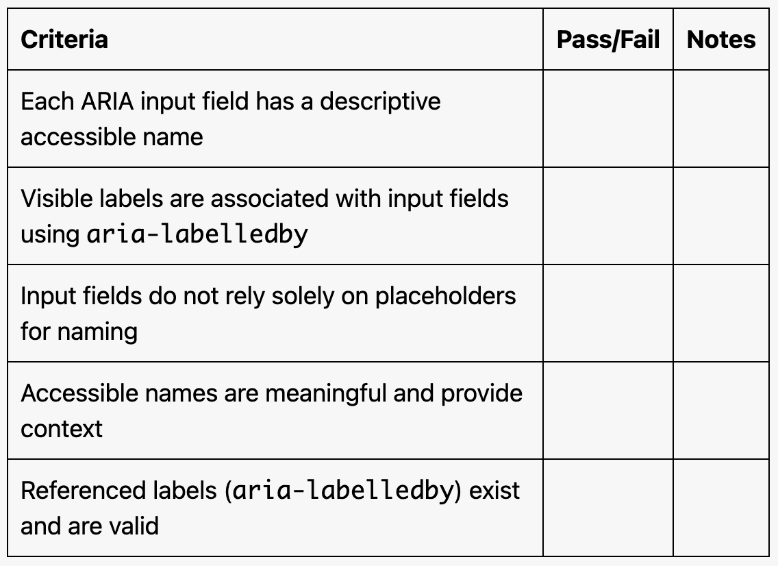
Using
aria-labelledbyto Reference Visible Text:
Thearia-labelledbyattribute references the visible label ("Username:"), ensuring the input field is appropriately named.
Using a Placeholder with
aria-label:The aria-label ("Search for articles") provides a descriptive name, while the placeholder offers additional hints.

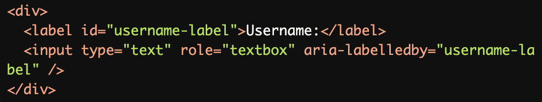
Naming a
comboboxwitharia-labelledby:The aria-labelledby attribute associates the visible label ("Select Country:") with the combobox, ensuring proper naming.
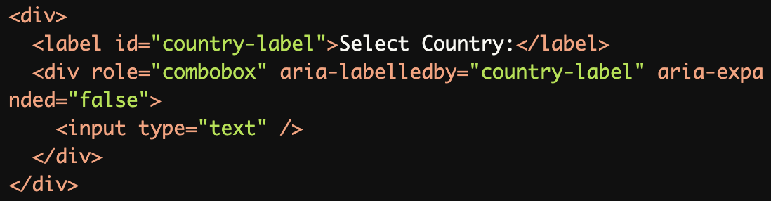
Providing a Name for a
slider:The aria-labelledby associates the visible label ("Volume Control:") with the slider, ensuring the control is properly announced.
Common Errors to Avoid
Missing Accessible Name:
Without anaria-labeloraria-labelledby, the input field lacks an accessible name, making it unusable for screen reader users.

Using
placeholderas the Only Label:
The placeholder ("Enter your email") is not an accessible name. Screen readers may not always announce placeholders reliably.

Referencing a Non-Existent Label:
Thearia-labelledbyreferences an invalid or non-existentid, leaving the input field unnamed for screen readers.

Non-Descriptive Name:
Thearia-label("Input field") is too generic and does not provide meaningful context about the field's purpose.

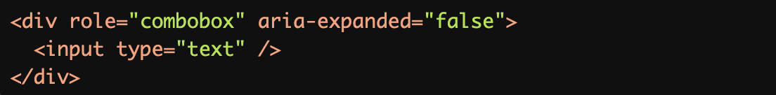
Missing Label for
combobox:Without an aria-label or aria-labelledby, the combobox lacks a descriptive accessible name, making it inaccessible.
Rationale
Essential for screen reader identification
Provides context for input purpose
Enables proper form navigation
Ensures input field accessibility
Required for meaningful interaction
Evaluation Method
Inspect the Code
Verify that each ARIA input field:
Has a descriptive accessible name using
aria-labeloraria-labelledby.References a valid and meaningful label.
Avoids relying solely on placeholders for labeling.
Test with Assistive Technology
Use a screen reader (e.g., NVDA, JAWS, or VoiceOver) to confirm:
Input fields are announced with their correct purpose.
Labels are associated with the corresponding input fields.
Placeholder text is not confused with the accessible name.
Evaluation Checklist