***This document provides helpful tips to improve your site's accessibility. While it doesn’t guarantee 100% compliance, it’s a great starting point to make your website more inclusive and user-friendly.***
Identification
Select elements must have accessible names (Rule ID: select-name)
Applicable Standards
WCAG 2.0, 2.1, 2.2 Level A (4.1.2)
Section 508 (1194.22)
Trusted Tester (5.C)
EN 301 549 (9.4.1.2)
Impact
Critical level impact affecting:
Blind users
Low vision users
Users with mobility impairments
Proper Implementation
Select elements must have labels using one of these methods:
Explicit labeling using
labelwithforandidattributesImplicit labeling by wrapping
selectwithlabelaria-labelfor invisible labelsaria-labelledbyfor complex labeling scenarios
Examples of Correct Usage
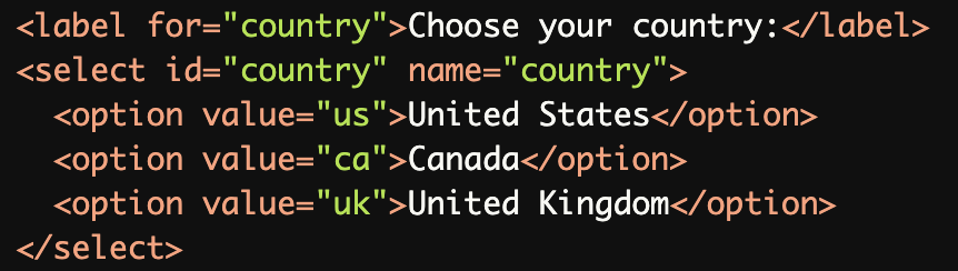
Explicit Labeling with
<label>andforAttribute:The
<label>is explicitly associated with the<select>element using theforattribute and the matchingid, ensuring screen readers can identify the purpose of the dropdown.
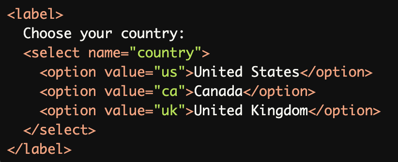
Implicit Labeling by Wrapping the
<select>with<label>:The <select> is wrapped within a <label> element, implicitly associating the label text with the dropdown for proper accessibility.
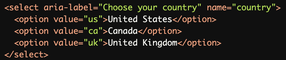
Using
aria-labelfor Invisible Labels:
Thearia-labelprovides an invisible label for the<select>element, making it accessible when a visible label is not desirable.
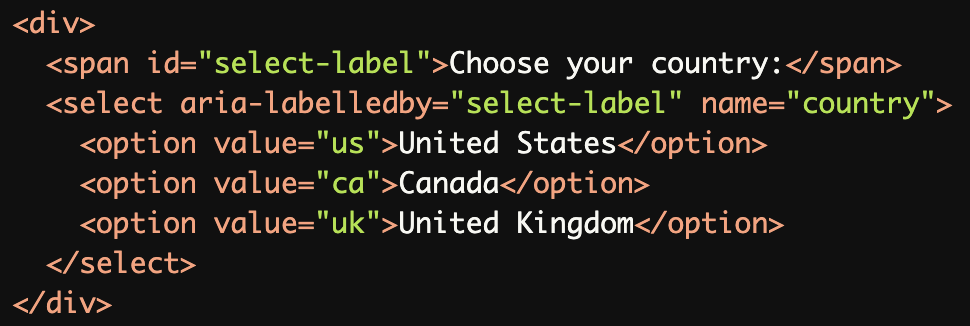
Using aria-labelledby for Complex Labeling:
Thearia-labelledbyattribute references an existing element (<span>in this case) as the accessible label for the<select>element, which is useful when custom layouts are used.
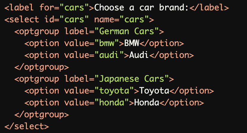
Grouping Related Options with
<optgroup>:The <optgroup> elements group related options under a label, improving screen reader navigation for dropdowns with multiple categories.
Common Errors to Avoid
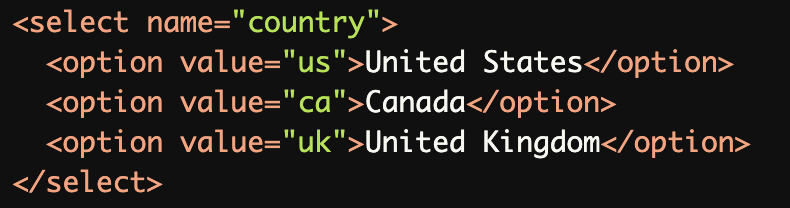
Missing Label:
The<select>element lacks an associated label, making it inaccessible for screen reader users who cannot determine its purpose.
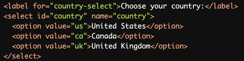
Mismatched for and id Attributes:
Theforattribute in the<label>references a non-existentid(country-select), failing to associate the label with the dropdown.
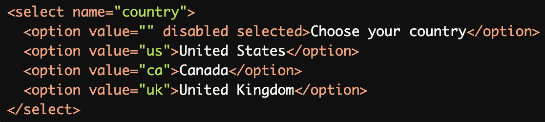
Using Placeholder Text as a Label:
Placeholder text ("Choose your country") is not a substitute for a proper label, as it disappears when an option is selected, leaving no accessible label for screen readers.
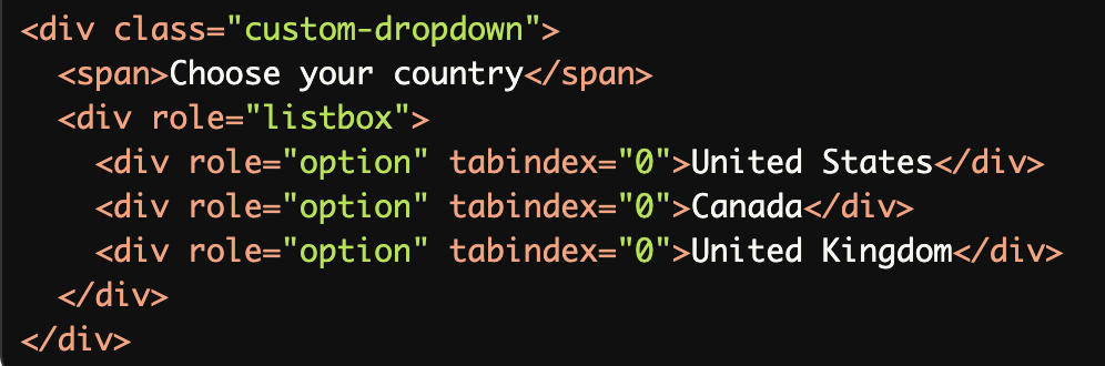
Inaccessible Custom Dropdowns:
Custom-styled dropdowns without proper ARIA roles, labels, or keyboard navigation are inaccessible to screen reader and keyboard-only users.
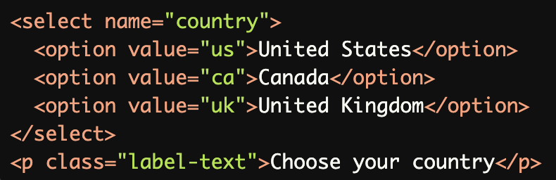
Using Only Visual Cues for the Label:
The visible text ("Choose your country") is not programmatically associated with the<select>element, making it inaccessible to screen readers.
Rationale
Screen readers need programmatic labels to identify form fields
Visual proximity isn't sufficient for accessibility
Labels eliminate ambiguity for all users
Essential for proper form navigation and completion
Helps users understand input requirements
Evaluation Method
Inspect the Code
Verify that the
<select>element has a visible or programmatically associated label.Check for proper use of
forandidattributes, or ensure thataria-labeloraria-labelledbyis used correctly.
Test with a Screen Reader
Use a screen reader (e.g., NVDA, JAWS, or VoiceOver) to navigate the form.
Ensure the label is announced when the
<select>element receives focus.
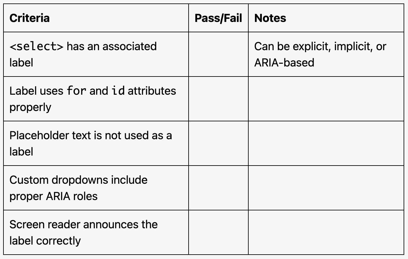
Evaluation Checklist